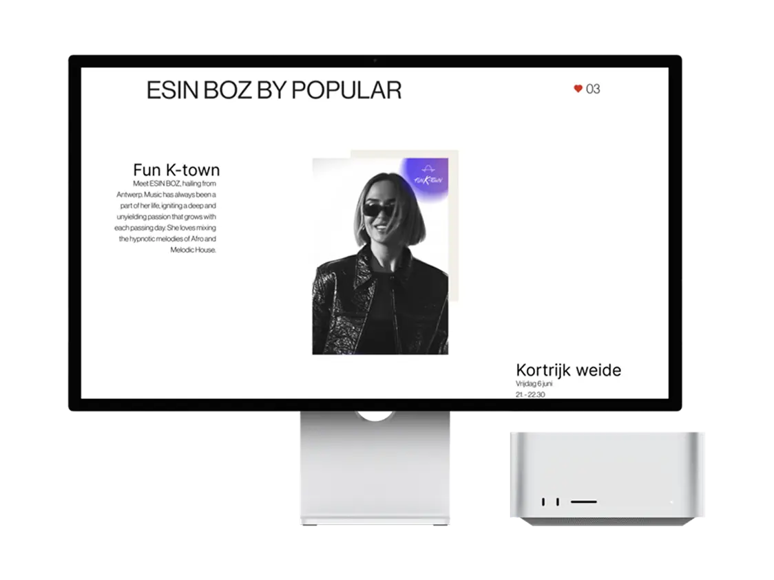
Sinksen 2026
Designing a Festival Website Through a Japandi Lens
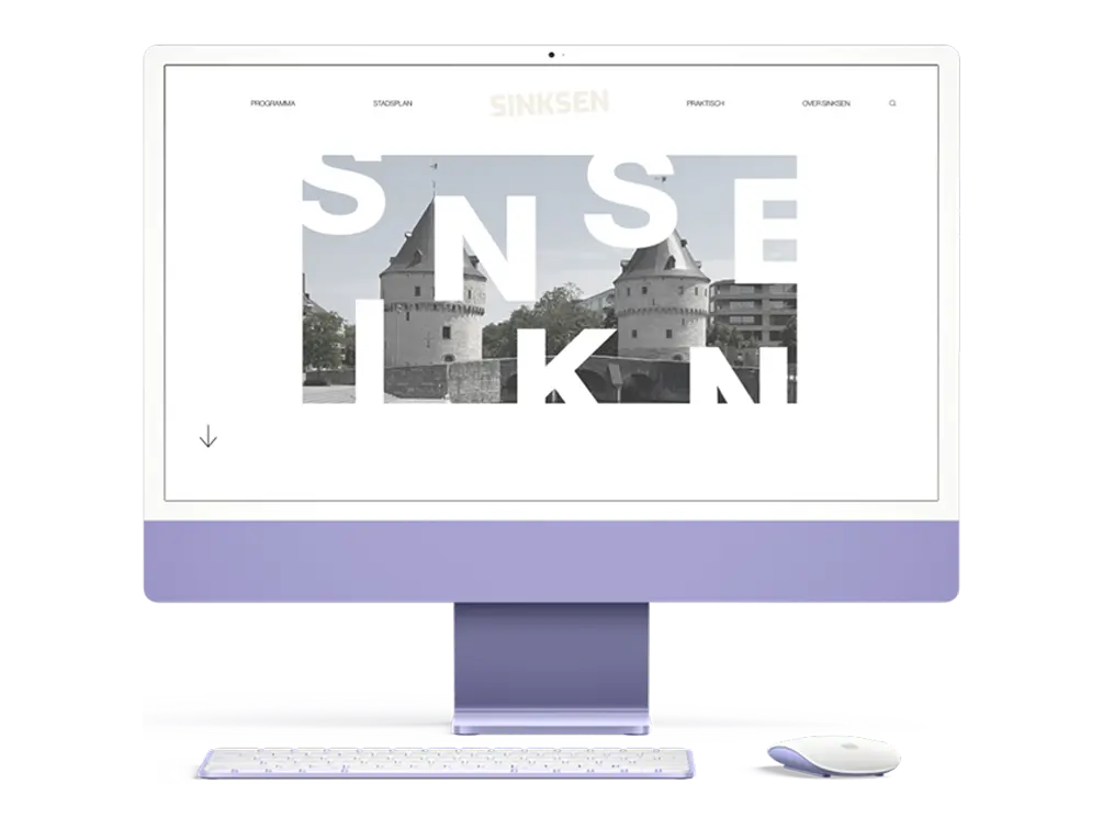
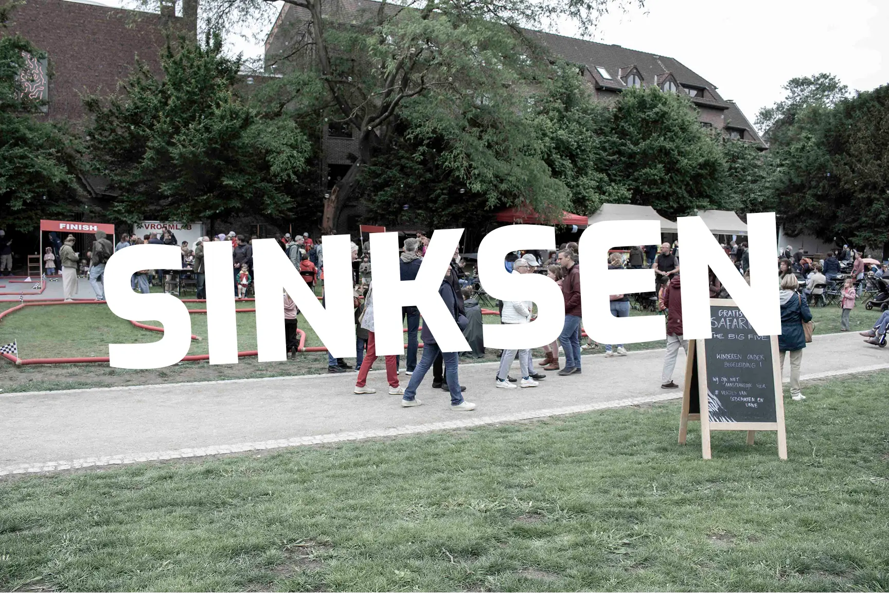
Sinksen is Kortrijk's biggest city festival: four days every Pentecost weekend where the historic city centre turns into one giant stage for live music, street theatre, a massive flea market and spontaneous street parties, drawing well over 200,000 visitors. For this project, the City of Kortrijk (the brief's client) needed a website for the 2026 edition that visitors could use to plan their entire weekend: discover artists and activities, find their way around the city, register for limited-capacity events, and book a spot at the flea market.
The twist: every year, the Sinksen identity is rebuilt around a new visual theme that runs through the website, the video content and the photography. My theme was Japandi, the calm, natural fusion of Japanese minimalism and Scandinavian warmth. My challenge was to take a festival that's loud, dense and chaotic by nature, and filter it through a design language built on restraint, negative space and natural materials, without losing any of Sinksen's energy.
The challenge
The brief came with a fixed set of functional requirements, written as user stories, that the site had to support, regardless of visual theme:
- Visitors need a clear homepage overview of everything the site offers
- Visitors need to discover which activities and artists are happening, with the ability to like activities and see like counts and featured picks
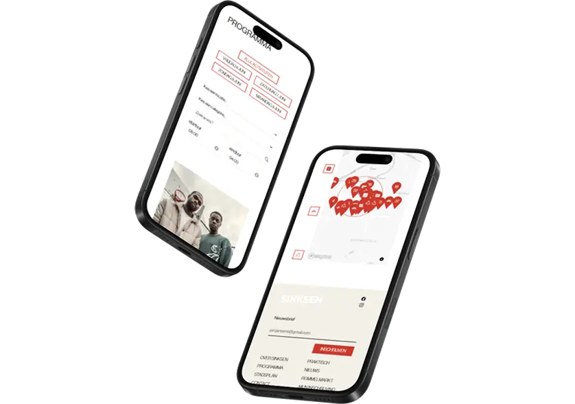
- Every activity needs its own detail page, plus an overview page with filtering (day, location, category, time) and search
- Activities requiring registration need to be clearly flagged, with a full registration flow: confirm, view, edit, or cancel a booking
- An interactive map lets visitors explore city regions and Points of Interest, and drill into a region to see its locations and activities
Design process
Research & moodboard
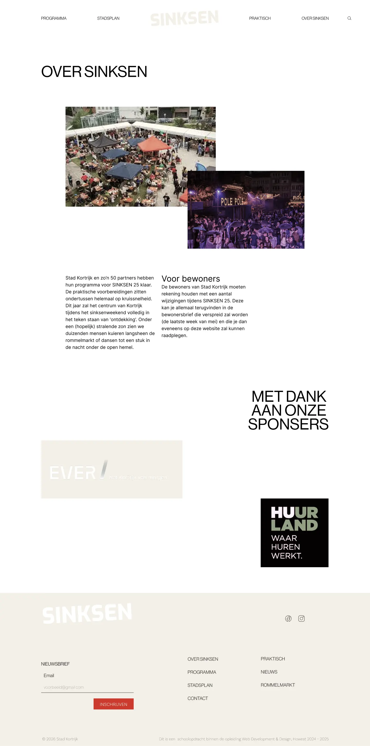
I started from a Japandi moodboard and dug deeper into both halves of the style, Japanese wabi-sabi and ma (the beauty of negative space) on one side, Scandinavian hygge and natural materiality on the other. I translated that into a personal angle for Sinksen: instead of literal Japandi props (which don't belong at a Belgian street festival), I leaned on the principles, generous whitespace, muted natural tones with one warm accent, organic shapes, and a slower, more deliberate visual rhythm, applied to festival content.
Typography & colors
Headlines
Neue Haas Grotesk
ABCDEFGHIJKLMNOPQRSTUVWXYZ
abcdefghDijklmnopqrstuvwxyz
0123456789(@.!?-)
'Black'
#202020
Body
Inter
ABCDEFGHIJKLMNOPQRSTUVWXYZ
abcdefghijklmnopqrstuvwxyz
0123456789(@.!?-)
'White'
#FFF
Accent
(Orange-red)
#CC3A2E
Neutral base
(light beige)
#F3EFE6
Neutral dark
(almost black)
#202020
Outcome
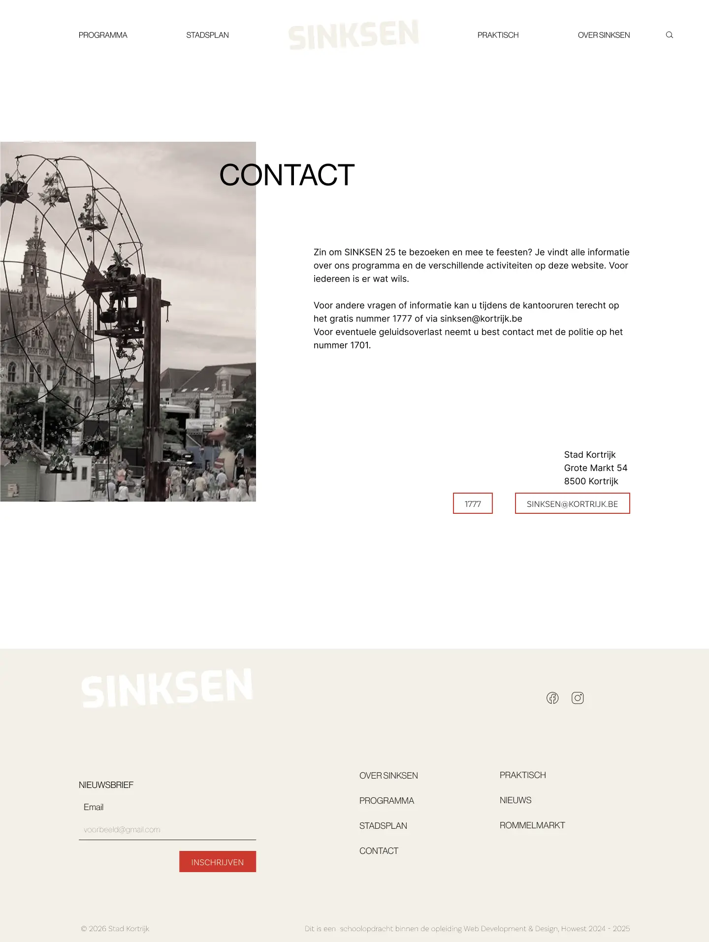
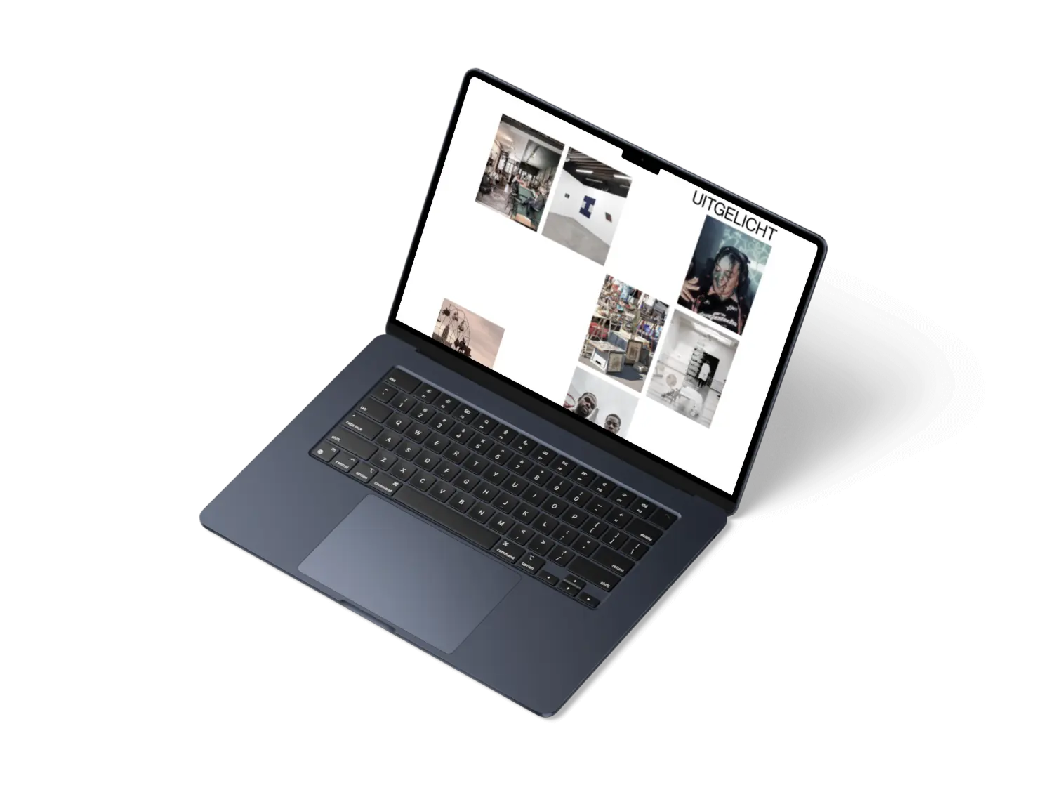
A full concept for the Sinksen 2026 website that reframes a high-energy, high-traffic city festival through a Japandi design lens. The result shows that a strong design theme doesn't need to fight a complex, content-heavy use case — applied through principles rather than props, Japandi's restraint actually made the dense festival information easier to scan, not harder.
Skills & tools
- Figma
- Visual identity
- UX / UI Design
- Typography
- User stories
- Wireframing
- Components
- Design Systems
- HTML / CSS
- Javascript
- PHP Laravel